Getting the artwork and image colouring correct is a concern for any company whether big or small. You will have spent money creating a brand and want it to look right when reproduced onto any promotional product you decide to purchase. When arranging for your artwork to be printed onto a promotional gift like a pen, coffee mug or keyring, you will be asked what colour you want it printed in. Within the promotional gifts marketplace, these colours are often referred to as ‘pantones’, or sometimes ‘PMS’.
The system gives each specific colour an identity, referred to by a unique number, this is your pantone reference number.
If you don’t know your specific colour reference, we can do our best to match a colour for you, and will look at any images you send to us by email, but its important to remember that there’s a good chance the colours will look different on our computer screen than they do on yours. Every computer monitor is different, every printer is different, and unless your computer is calibrated with the Pantone hue, the colour depicted will always appear slightly different.
If you don’t know your reference numbers, ask your printer. He probably does, as he will have needed to match your colours when he printed your business cards, letterheads, or brochures. If you don’t have a printer, or they can’t help you, just ask us, there’s always a solution, and we will find a way.


1. Re-think you’re branding. Pens have a limited amount of space to customise.
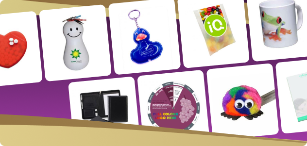
Promotional branded gifts can add massive value to your marketing message and create brand memories that are both engaging and impactful.
Shop all new products
If you’re from further afield, call or email us for friendly, unbiased advice about what promotional gift would work best for your campaign!
Contact Us